Helping users access their nutrition data more easily on the NalaGenetics App
Role
Product Designer
Timeline
Q2 2022
Result
The design has been implemented by engineering and will be completed in Q2 2023

Product Designer
Q2 2022
The design has been implemented by engineering and will be completed in Q2 2023
NutriReady is a product from NalaGenetics that allows users to assess the nutrients present in the human body. It includes features such as identifying food intolerances, determining the nutrients your body requires, and creating personalized meal plans based on your unique DNA.
The genetic results are provided in a PDF report format. However, users often find it challenging to read the lengthy report, which spans over 50 pages. A mobile app version of the report is necessary to enable users to easily search for nutrients according to their needs.
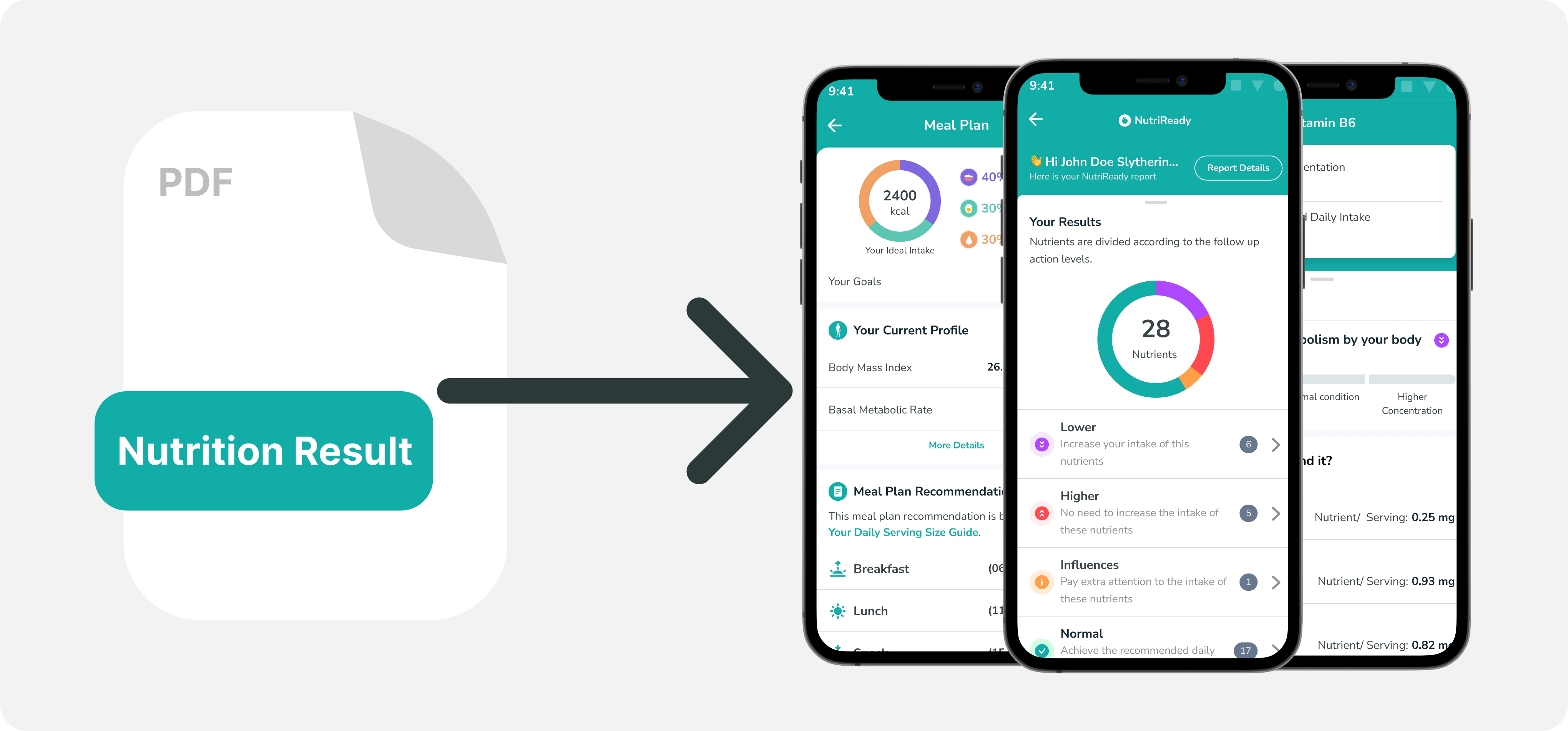
The genetic report in PDF format has several issues:
There are over 50 pages in a single PDF report, making it difficult for users to scan the genetic results. The user must also search for one per page if it is in physical form (printed).
PDFs are typically static documents, lacking interactive features that may enhance the user experience or allow for dynamic data analysis.
PDFs can become large in size, especially if they contain numerous images or data tables, which may make user cumbersome to download or share.
Some PDF features may not be supported by all devices or software versions, leading to compatibility issues that can affect the viewing experience.
PDFs may present accessibility challenges for users with disabilities, such as screen readers not being able to interpret the content accurately.
Before exploring the Design, I need to know how users read and prioritize the information in a mobile app. Here are some objectives that we want to figure out:
How the user's behavior when reading the reports in PDF format?
What is the first thing users want to know when they see a report?
I conducted user research with internal users who have purchased or viewed this Report. Here are the results:
Most useful information is Summary of nutrient, this page is beneficial for users because they know what supplements they should take.
Since we already know that the most useful information is contained in the Summary of Nutrients for this case study, I will just focus on the Summary page.
I explored two options for the first exploration:
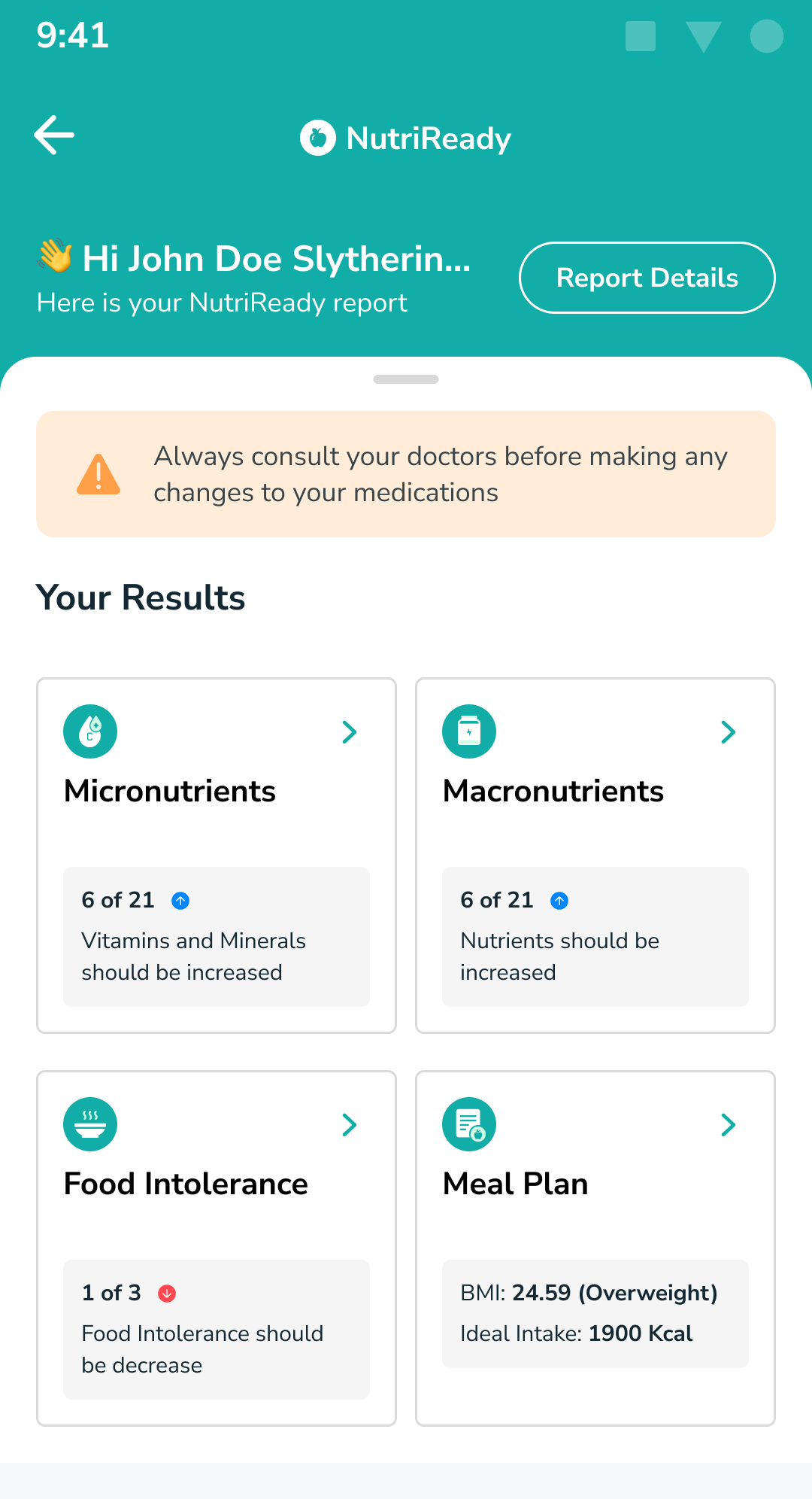
Option 1: focusing on intake
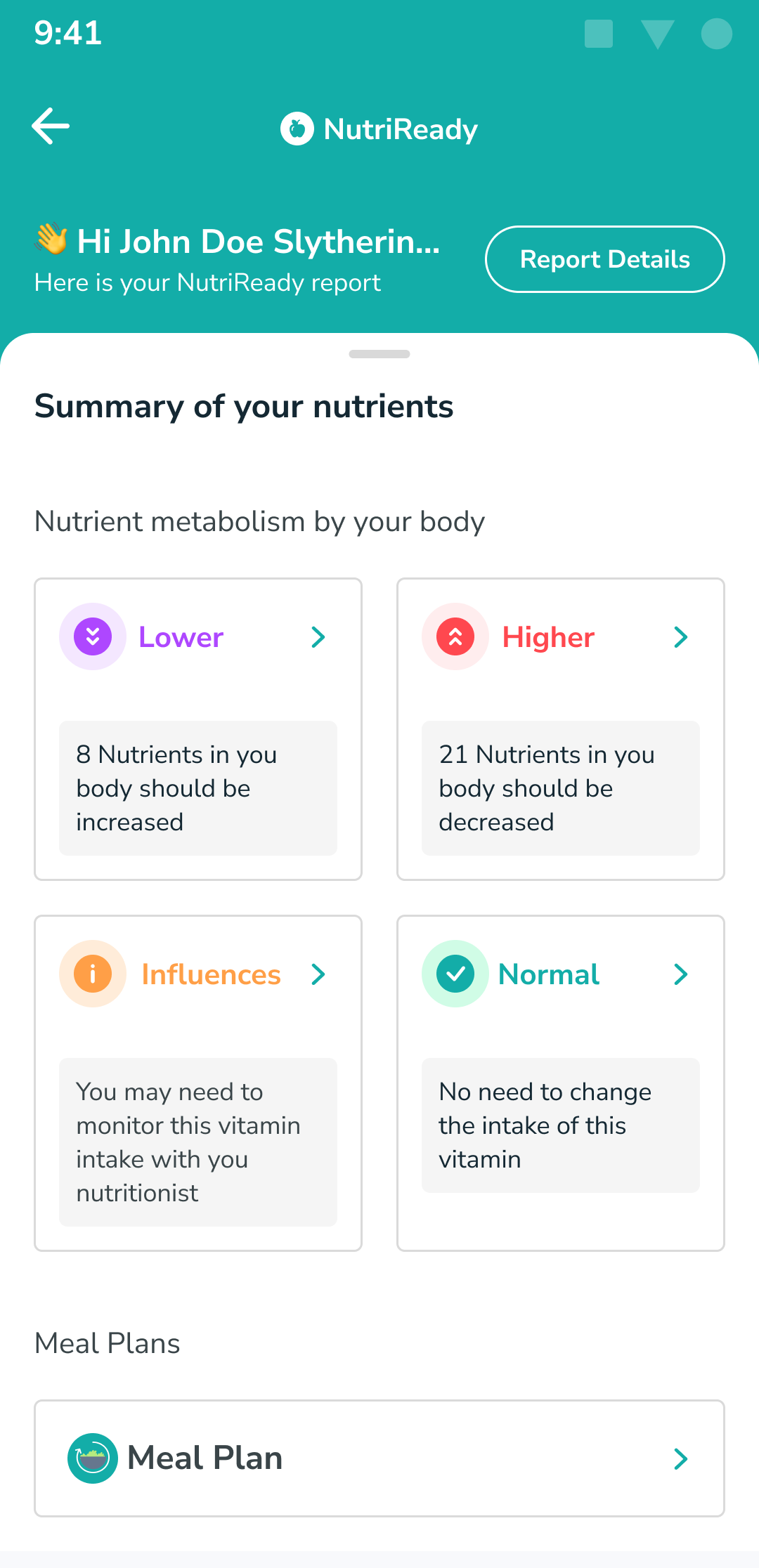
Option 2: focusing on indication
From the above 2 options, I requested quick feedback from my designer and project manager colleagues and here are some of their feedback:
The report still doesn't quite illustrate what is included in the Report PDF.
The height of the boxes is too high, causing them to be cut off and not fully displayed on smaller devices.
In Phase 2, I am trying to explore several options again based on the initial feedback. This is an example of the results of my exploration:
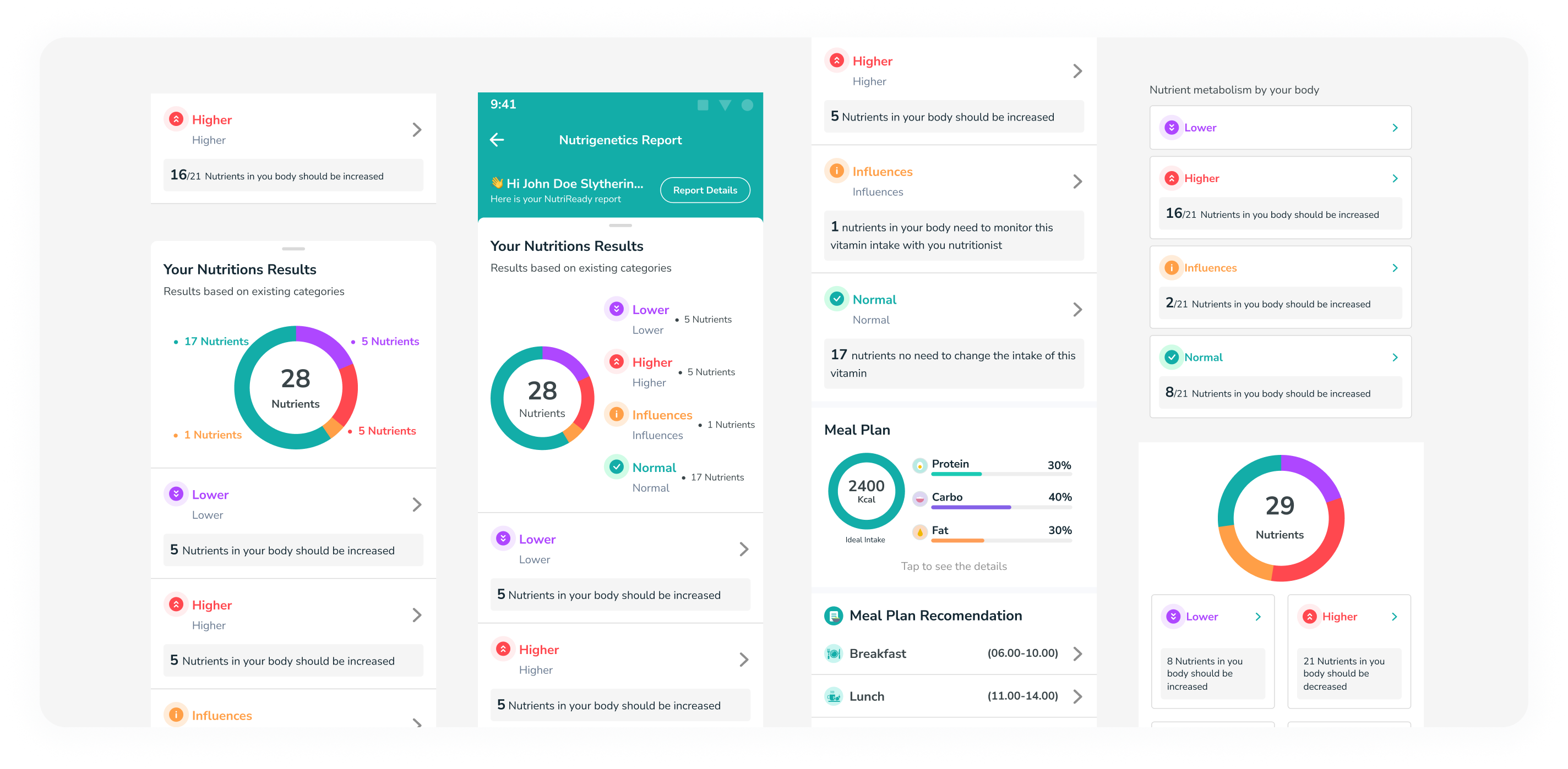
Exploring design canvas
Due to limitations, I am displaying the entire results immediately. So, from the above exploration, it becomes a design like this:
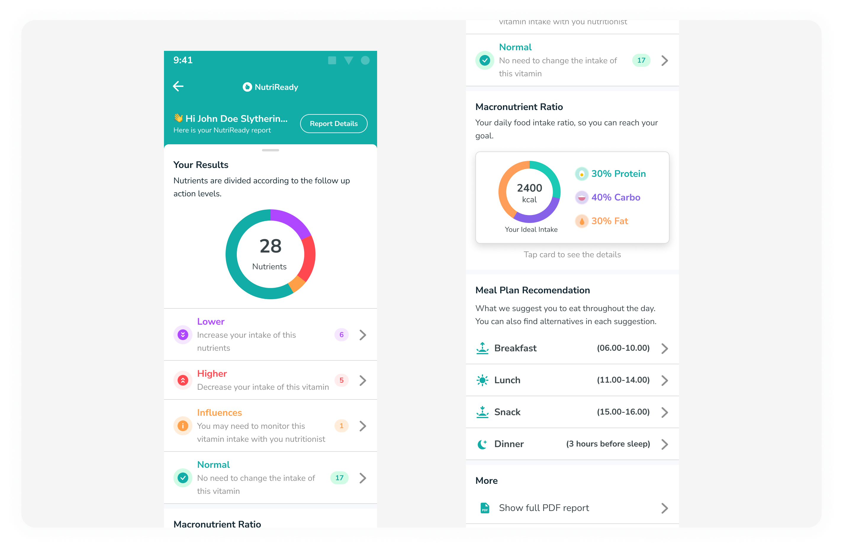
Final Design
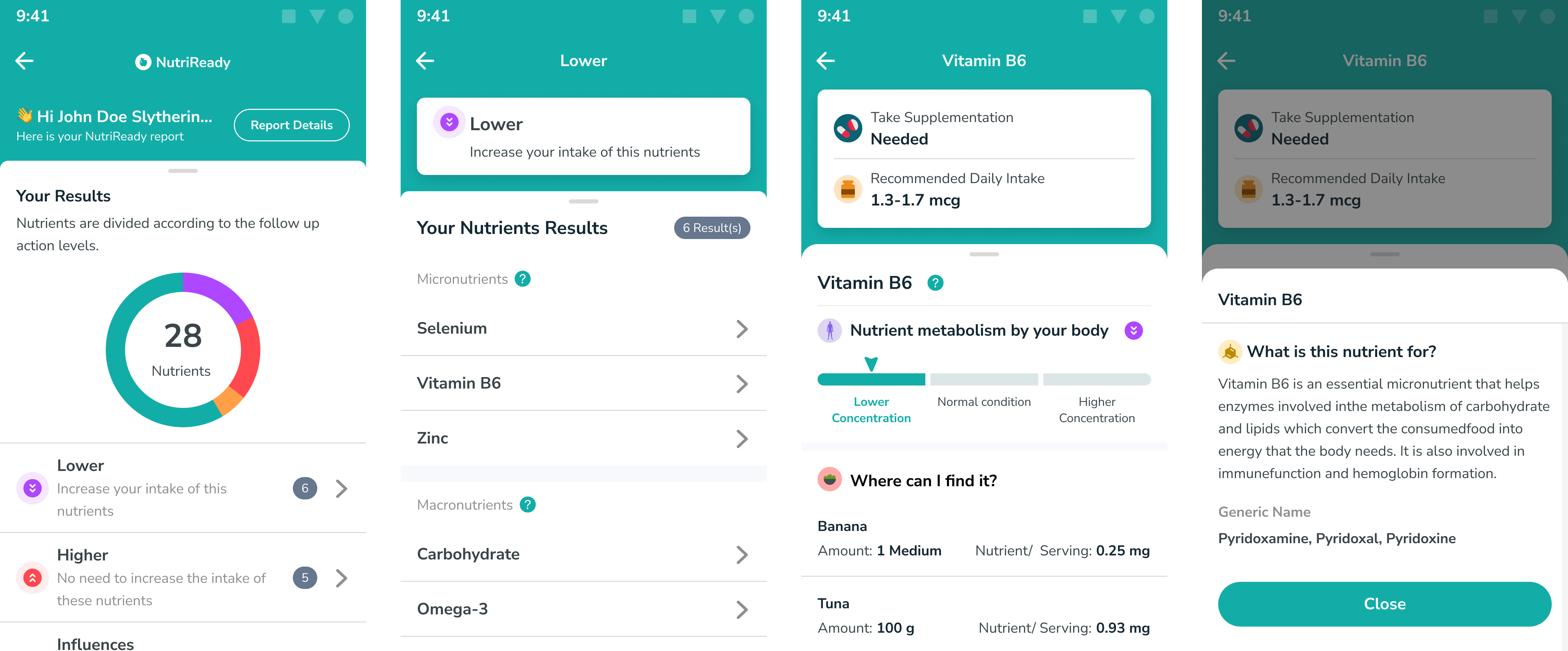
In this section, quite a lot has changed, and I'm trying to convey its visual aspect in the report. Here are the changes:
I placed the line chart visuals identical to the report. This is aimed at creating a consistent impression with the report, allowing users to quickly see the conclusions of the results obtained.
The categorization is based on the Lower, Higher, Influences, and Normal categories.
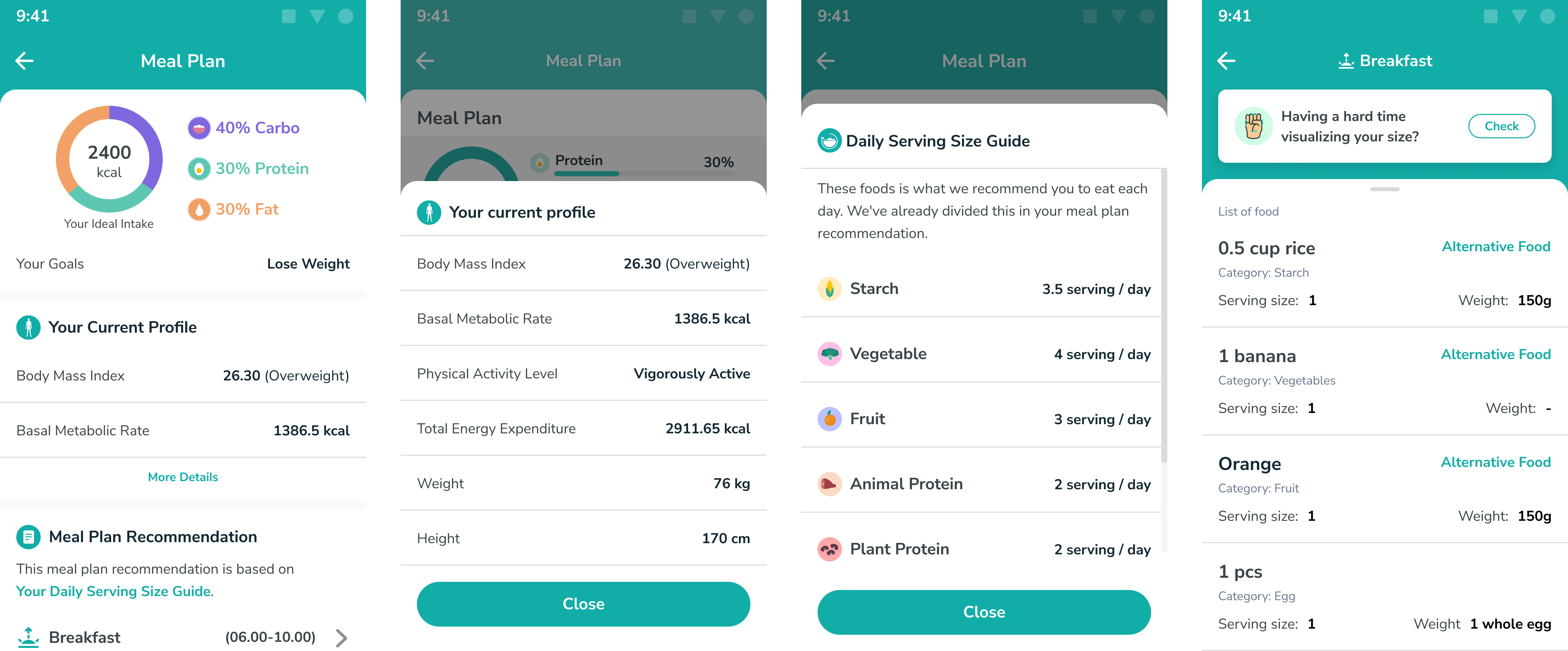
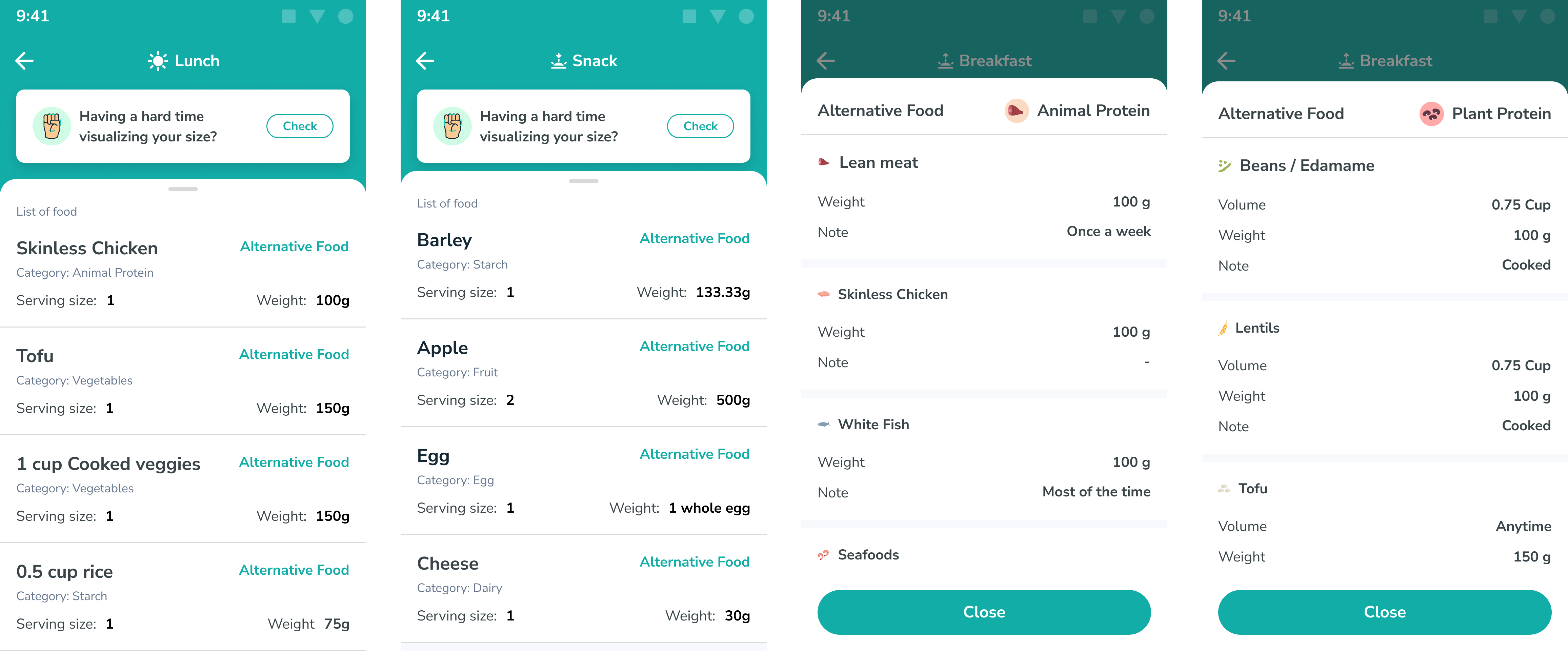
I also included the Macronutrient Ratio so that users can visually see what they should be eating.
Placing the Meal Plan Recommendation on the homepage for users to immediately view their daily intake.
We are conducting Usability Testing to observe user responses while using this application. Here is the prototyping in Figma:

Final Design
Based on the results of Usability Testing, we have made some changes according to the feedback.
Due to confidentiality issues, I cannot display the results in their entirety.
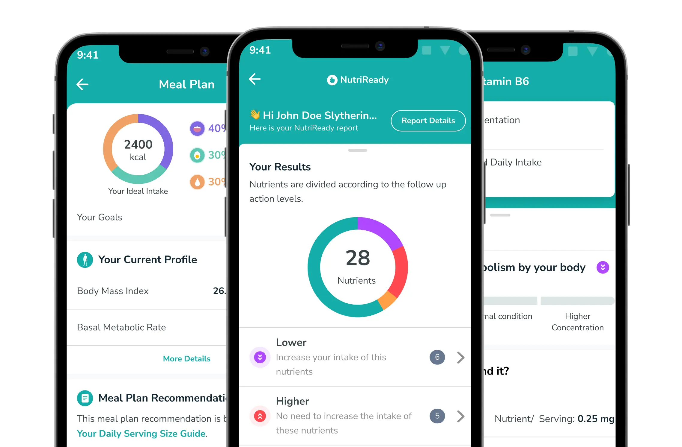
After conducting usability testing, I made further improvements to the homepage of the report. Here are the results:
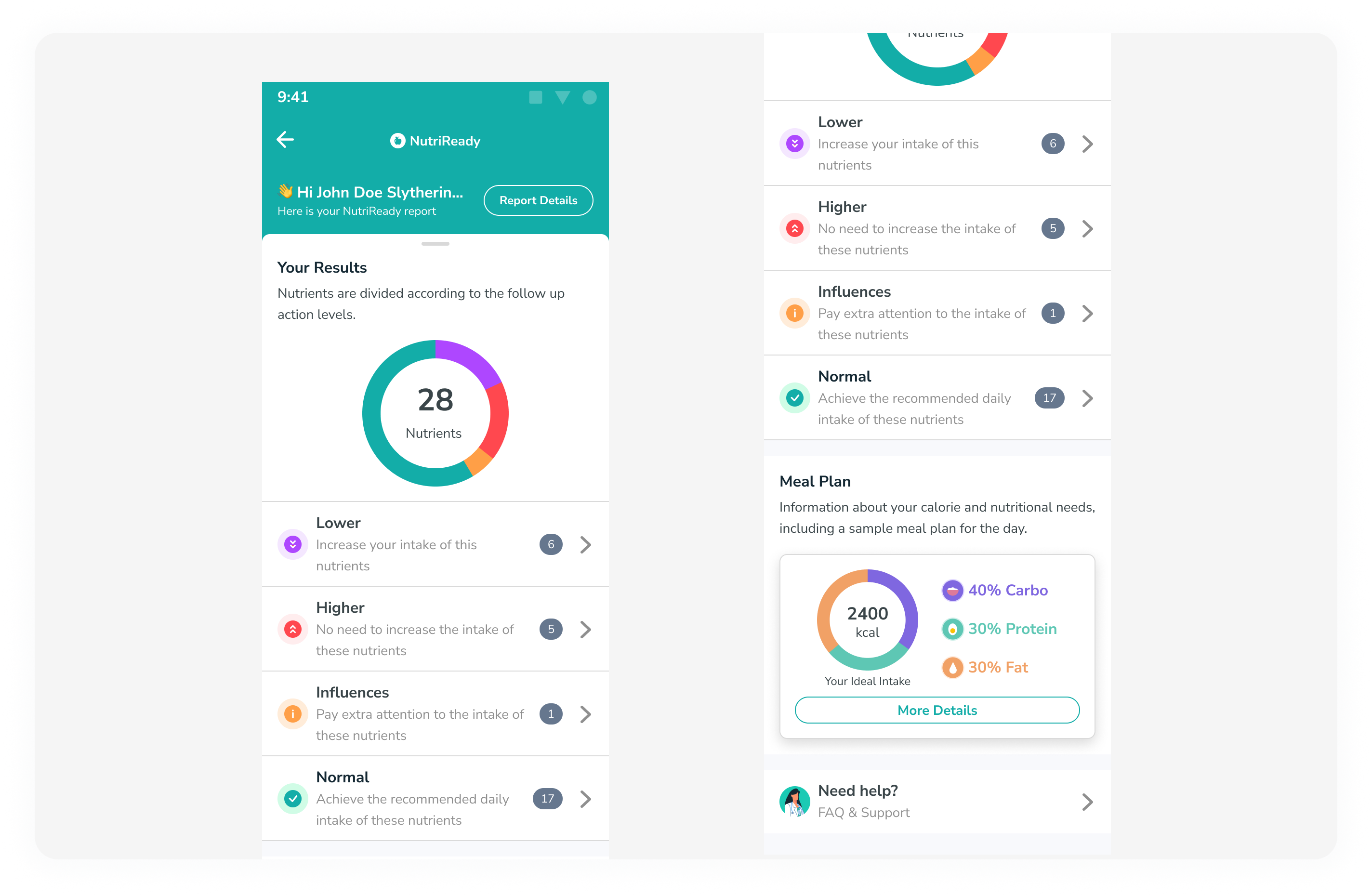
Here are some changes made based on usability testing:
Reduced the size the nutrient diagram compared to the previous version.
Changed the result label color in each list to be more consistent with the previous report.
Combined the Macronutrient section and meal plan into one section, as they are related.
Added a 'More Details' button on the Meal Plan Card to inform users that the card is clickable, instead of relying on text alone.
Overall Result
Several customers were very pleased with the availability of Genetic Reports in the app. Here's one example:
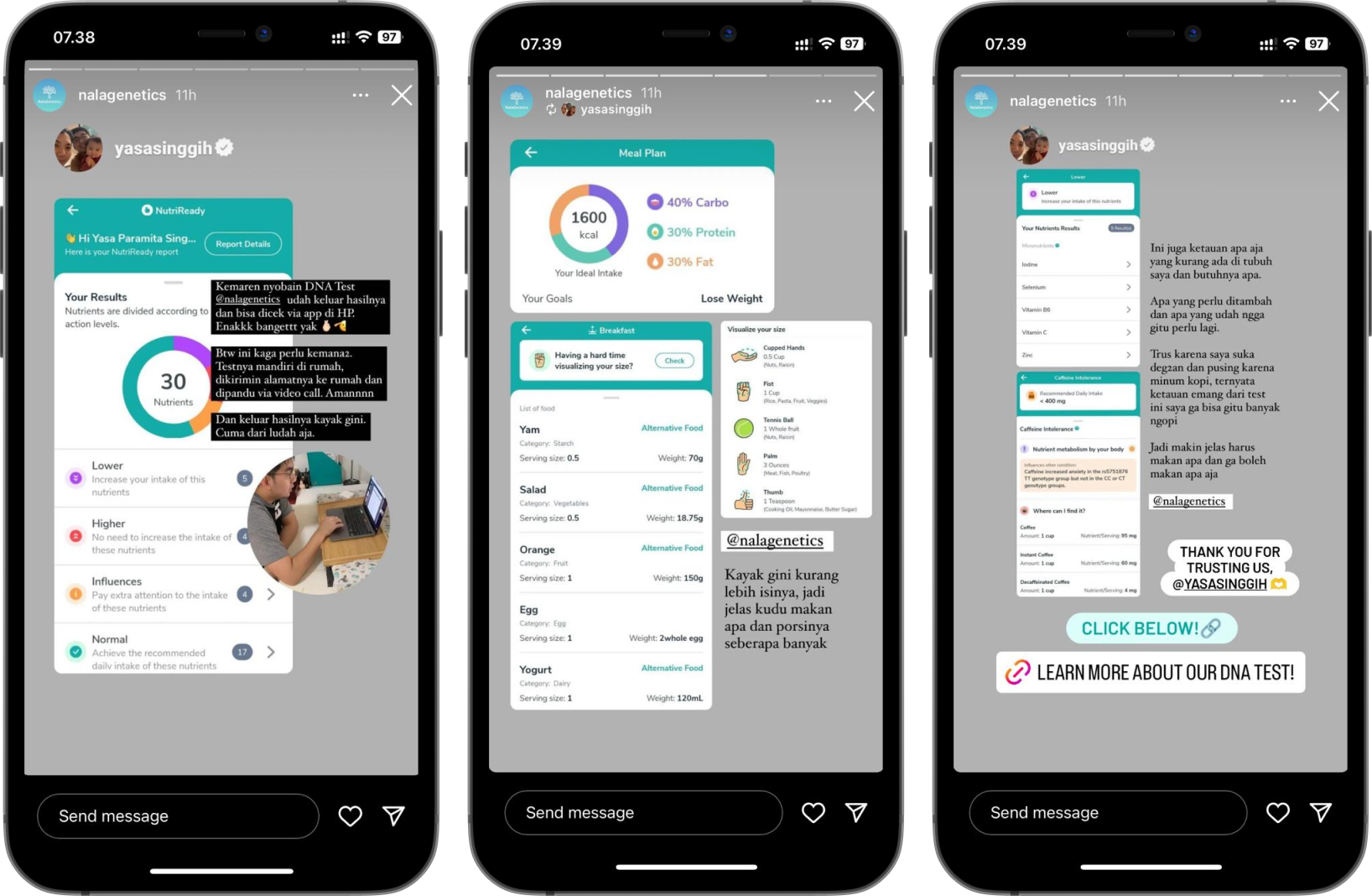
Customers feedback
We need to seek feedback and go through the process several times to achieve good results, not perfection. There might be improvements to this design in the future, so we always need to keep iterating.
