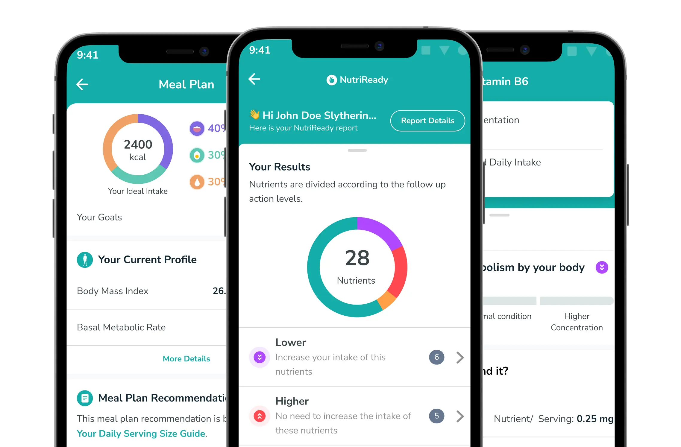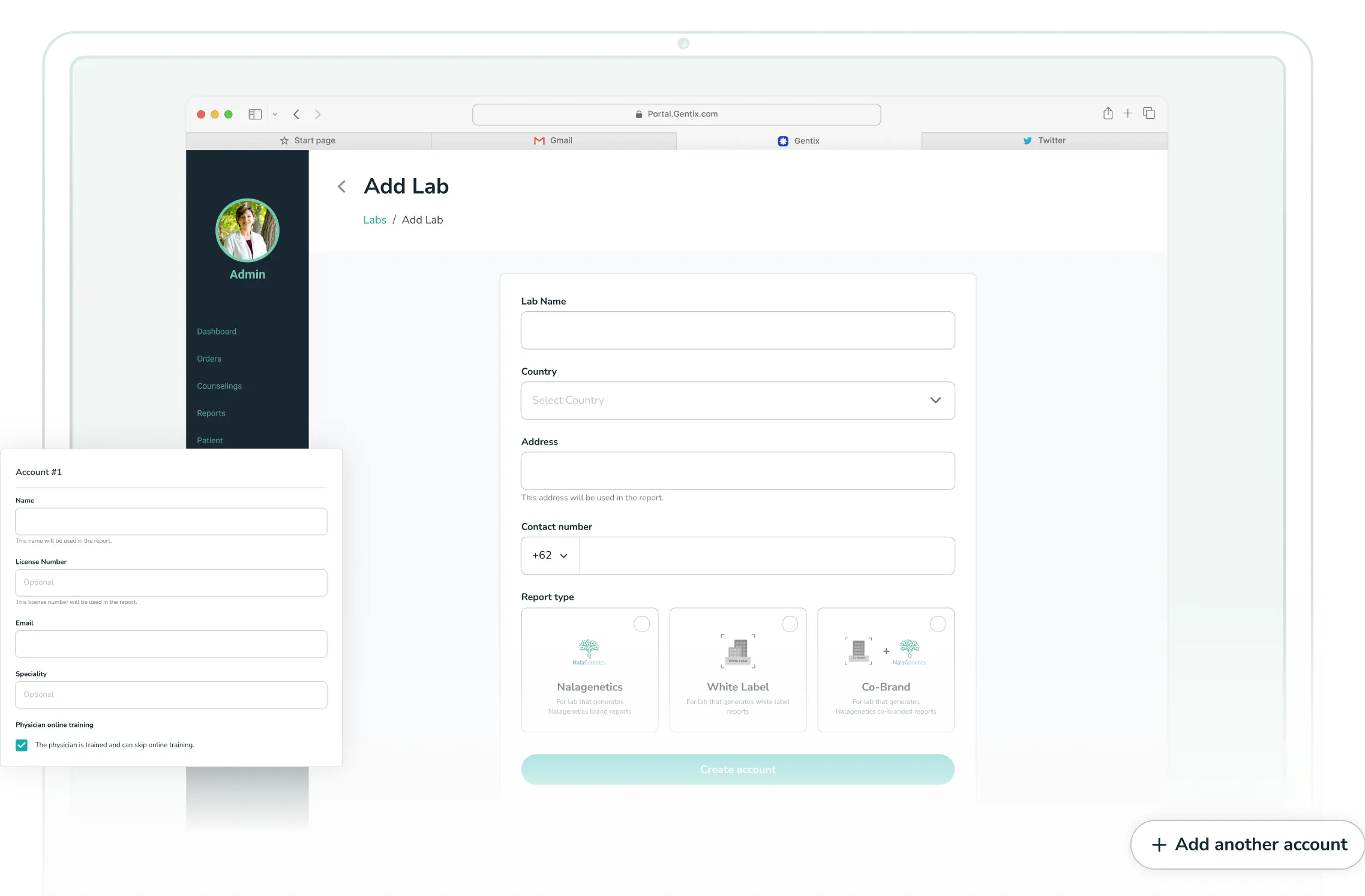
Improving Effectiveness Creating Accounts on the Dashboard
Role
Product Designer
Timeline
Q2 2023
Result
we achieved approximately a 75% faster completion time with the new design for creating an account on our dashboard.
Project Brief
Nalagenetics is a biotech startup specializing in human genetics. We have a web dashboard for creating genetic test orders, analyzing the tests, and generating PDF reports of the final results.
As is typical with dashboards, there are many account roles. We've received feedback that the user account creation process is overly detailed, so need to revamp it to make account creation more user-friendly to facilitate B2B business approaches.
Context
in our dashboard, we have some interconnected roles, so I need to figure out the role that we have and confirm what it is role doing in our pipeline. so for this project we focus on 4 roles:
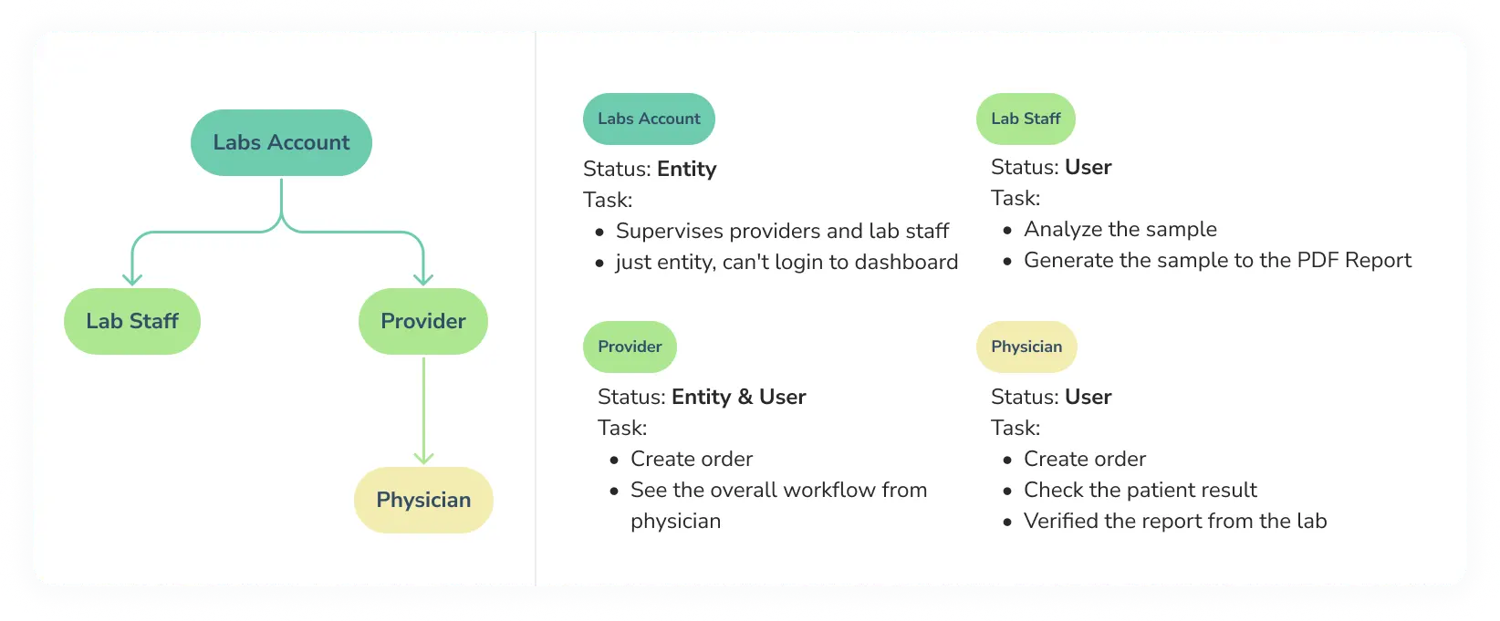
Role
Problem
Business Problem
To achieve product market fit, we need to make a seamless user experience to make sure that we can help client to achieve their goals. Here are some negative impacts that we found:
The account creation process takes a long time because there are many irrelevant fields, so the user input time is extended and this has an impact on granting the account to the client
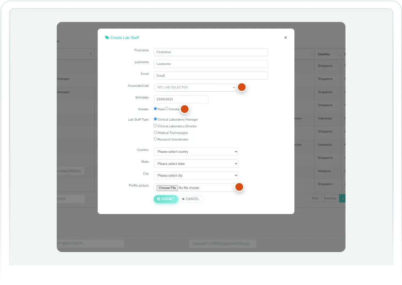
Irrelevant Field on Create Account Form for Lab
User Problem
We received a brief from the project manager, and before diving into the design, I conducted an audit of the dashboard's behavior. However, there are problems that we are aware of (PM & Design):
The complexity of the user journey
- Lab staff user need to find the lab
- And provider staff user need to find provider
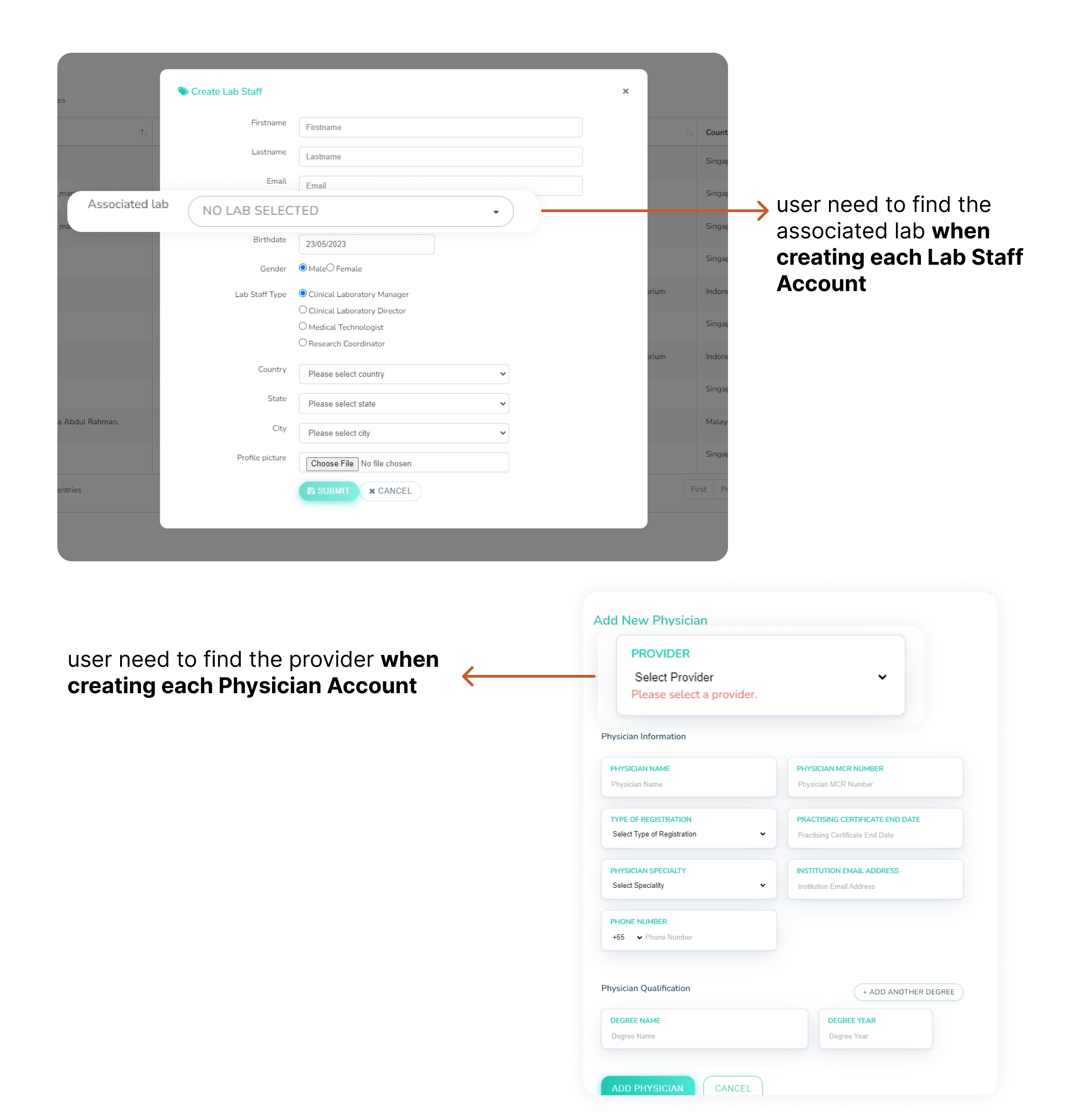
Irrelevant Field on Create Account Form for Lab
Inconsistency of each page
- We have 2 different form when creating the account.
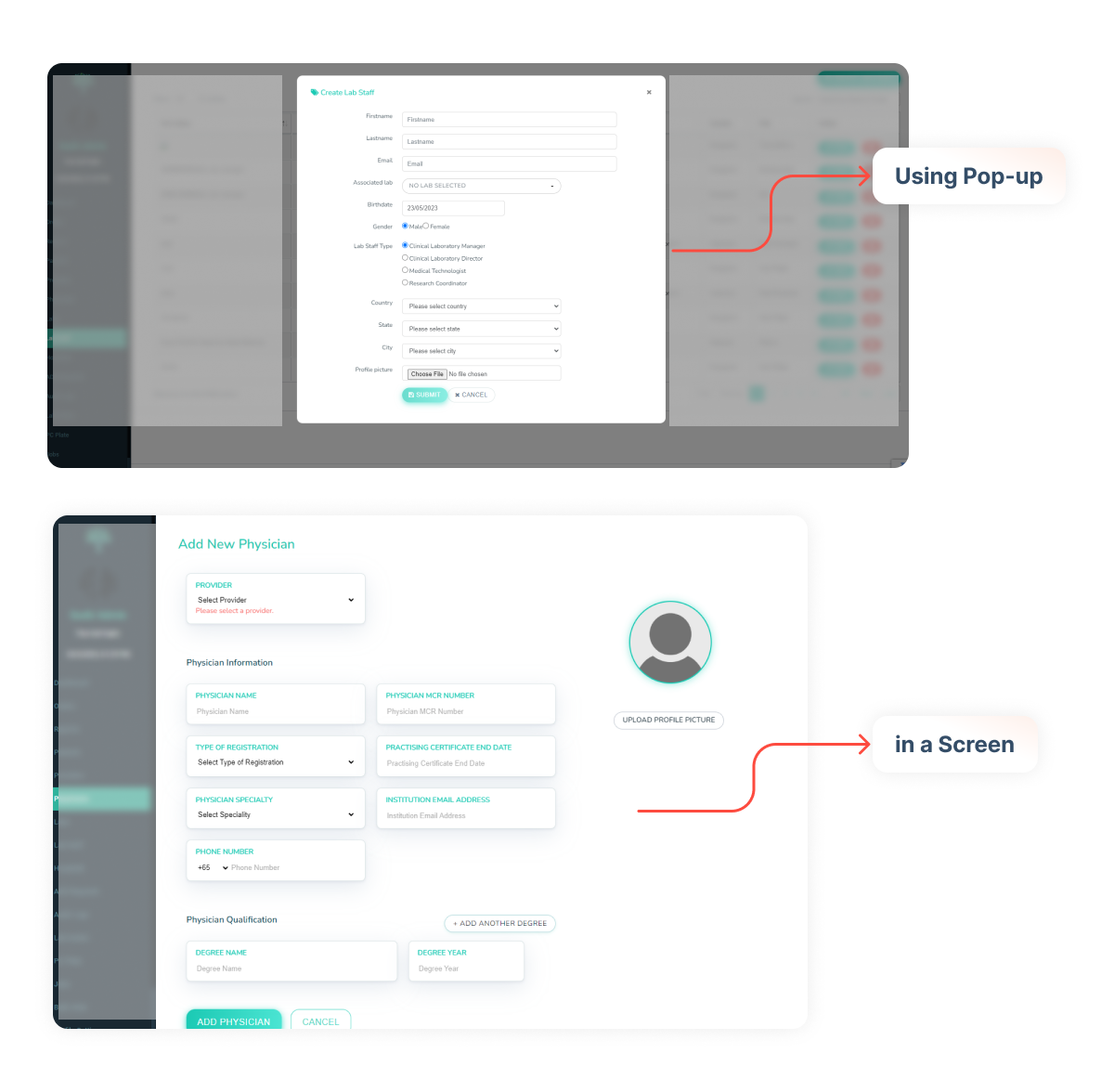
Example of image for Inconsistency on each page
No context and ambiguous steps/field
The user must think first about what to fill in a field that has no context
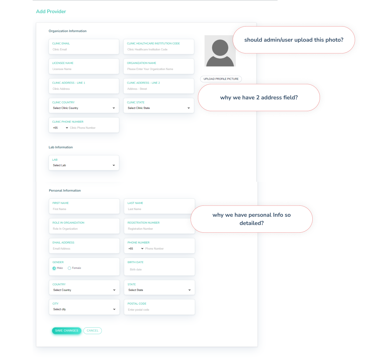
Example of no contect steps/field on Provider form
Validating the Problem
We conduct User Research to validate the problem and get more paint points from the user. Here are some objectives that we want to figure out:
We want to validate the problem that we get from the brief
We want to know the users' habits when creating a new account.
We want to identify which fields they leave blank.
We want to identify any additional fields that may be needed, as admins sometimes make changes in the backend.
1. Qualitative Research
The findings:
Hard to find the lab and providers during create the account for lab staff and provider
Some field can be removed
User says:
sometimes there are the same providers in the list and the user/client is a bit confused. maybe id that can be differentiated? there is no warning that makes the name of this provider the same. the context maybe they use different data but same provider name.
User says:
Associated labs are sometimes confused by internal user because usually users request lab staff but don't know where they are associated
User says:
The city is not available on the city field, so user find in maps what city near from list
User says:
birth date and gender it's no needed.
2. Observation
After reviewing the video recording and observing the interviewer's behavior, I have identified several key findings:
Time needed to create accounts
Creating Lab Account: 2 minute 45 second
Creating Lab Staff Account: 1 minute 45 second
Creating Provider Account: 1 minute 45 second
Creating Physician Account: 1 minute 55 second
1 Lab account: 2 minute 45 second
Creating 1 Provider Account: 1 minute 45 second
Creating Physician Account: 50 x 1 minute 55 second = 95 minutes and 50 seconds
Missinformation due to lack of information
Admin need to input multiple lab staff and physcian at the same time, Here the time calculation for each account when user creating:
Worst Scenario:
For example, our company collaborated with one hospital. On average, hospitals have 50 physicians. To create that hospital account in our dashboard, the admin should create 1 Lab account, 1 Provider Account, and 50 Physician accounts. So, let us calculate the time:
The duration for an admin user to create a one hospital account is: 101 minutes and 10 seconds (1 hour 45 minutes)
Admin don’t have complete data. So sometimes they will input random data, because there are many required fields.
Design Exploration
Simplify the User Journey
we realize user hard to find the lab account when creating Lab staff, and same with physician where need to find the provider. so we propose to move the lab staff and physcian tabs to Labs and provider.
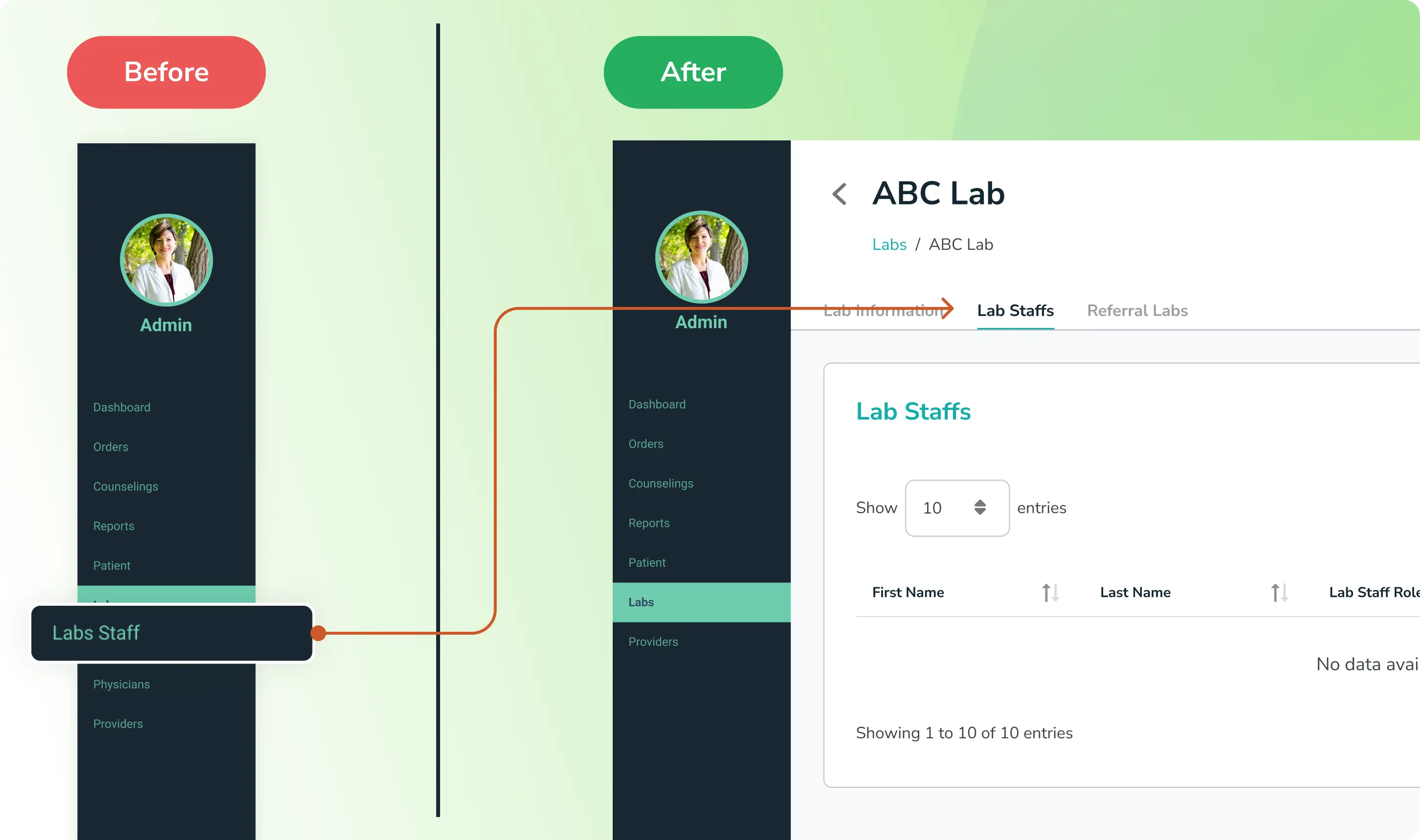
Move Lab Staff tab in sidebar inside Lab
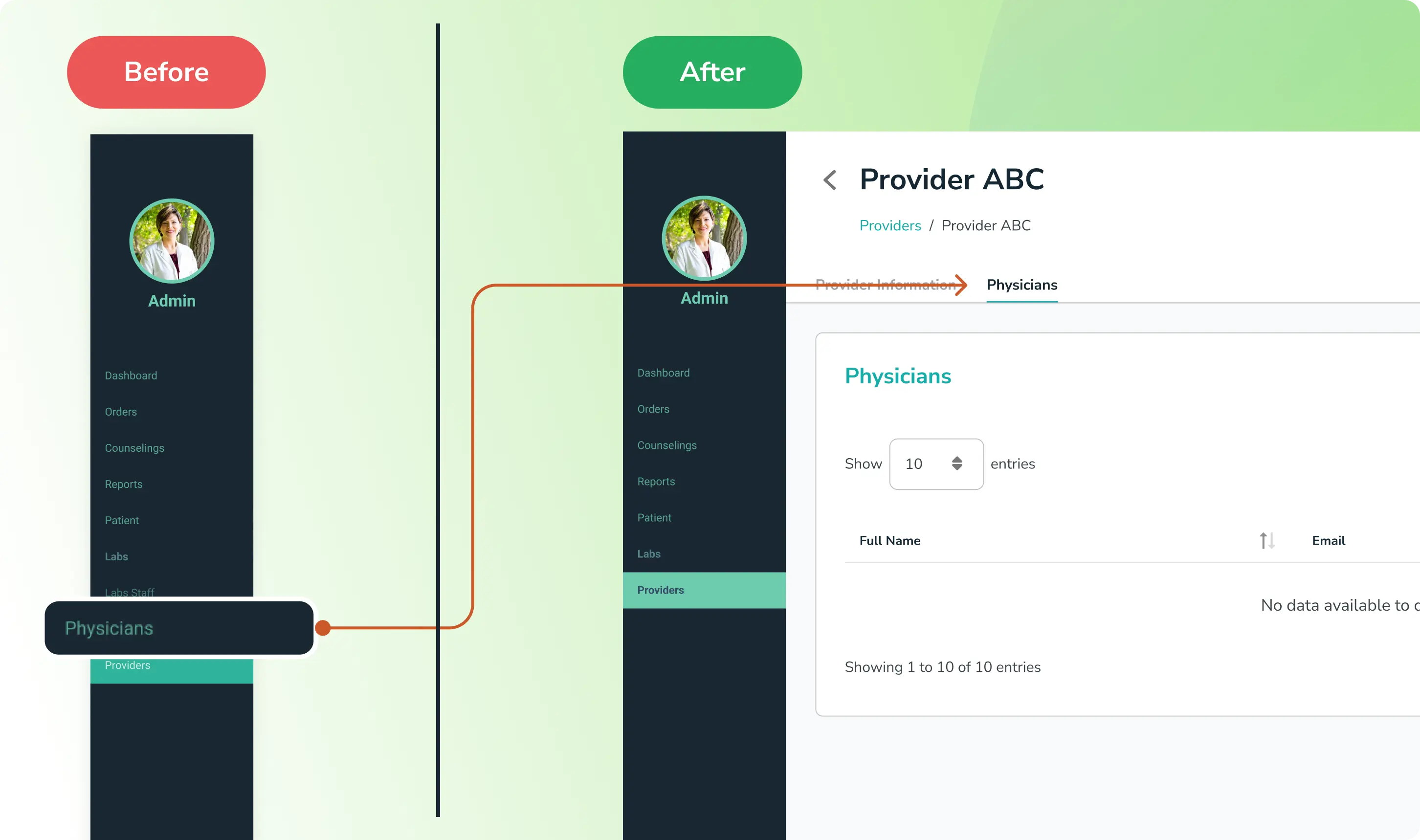
Move Physcian tab in sidebar inside Provider
The purpose is:
Allowing users to create a Lab Staff/Physcian account without the need to search for the Lab/Provider each time.
Simplifying the flow.
Minimizing the number of tabs in the sidebar.
Consistency of each page
We enhance consistency across all pages during the account creation process. Simply adding a layout with a header and content will significantly enhance the user experience.
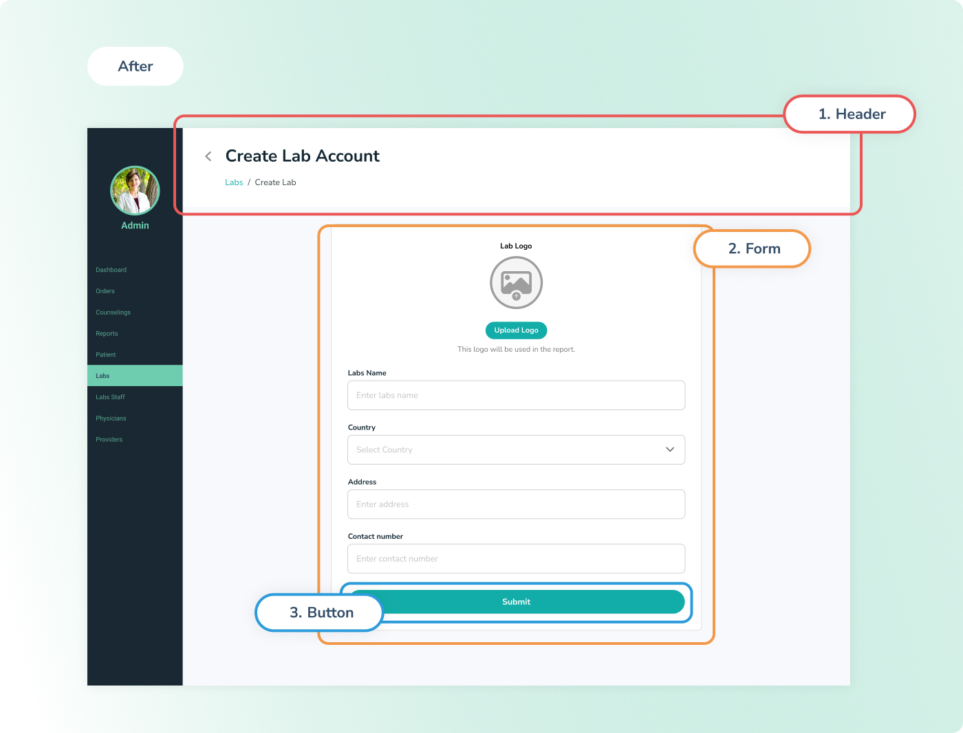
Labs after consistency
Header: The header is designed to enhance user experience and improve navigation within our dashboard.
Form: All forms are uniformly designed.
Button: We've made the buttons larger and taller for easier user interaction.
Remove ambigous field
For Lab Account
We remove some field and make it more simple to make user/admin more easy to create the lab account
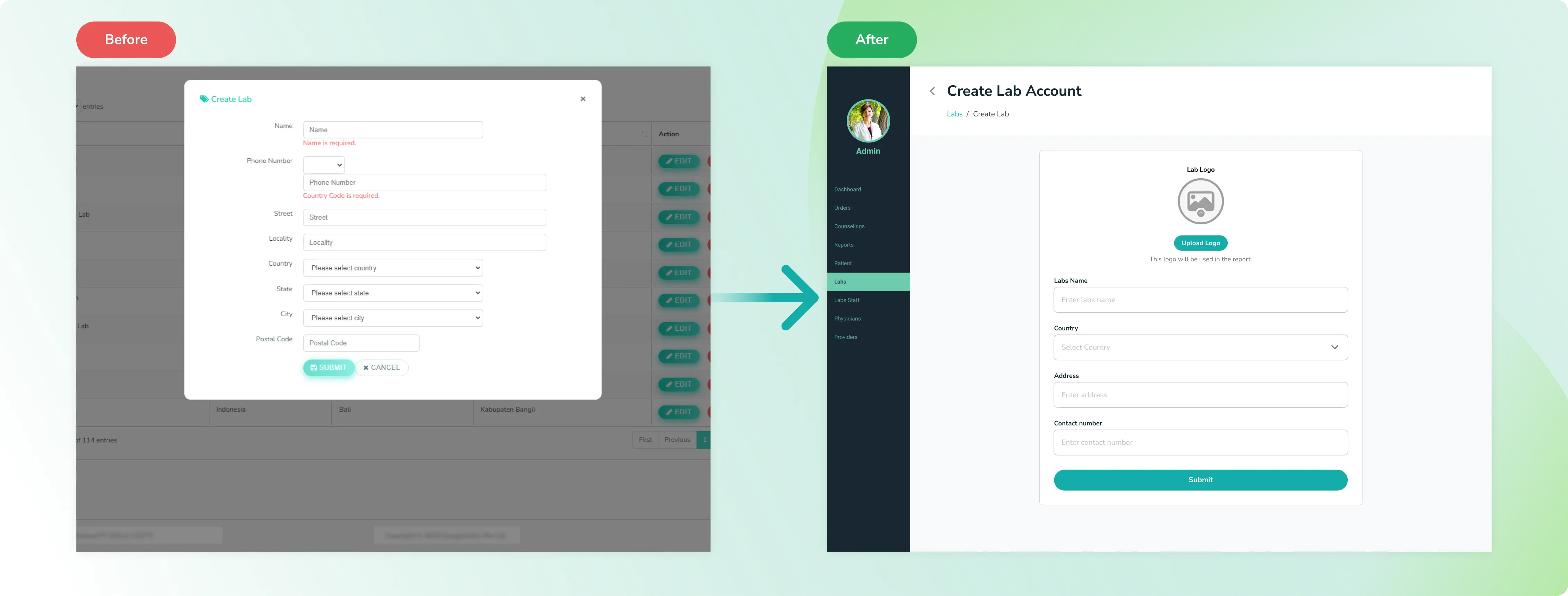
Labs before and after
For Lab Staff Account
We adding a add another account to make user/admin more fast and can create multiple account in same time. The solution we got after we observ how the behaviour admin create the account
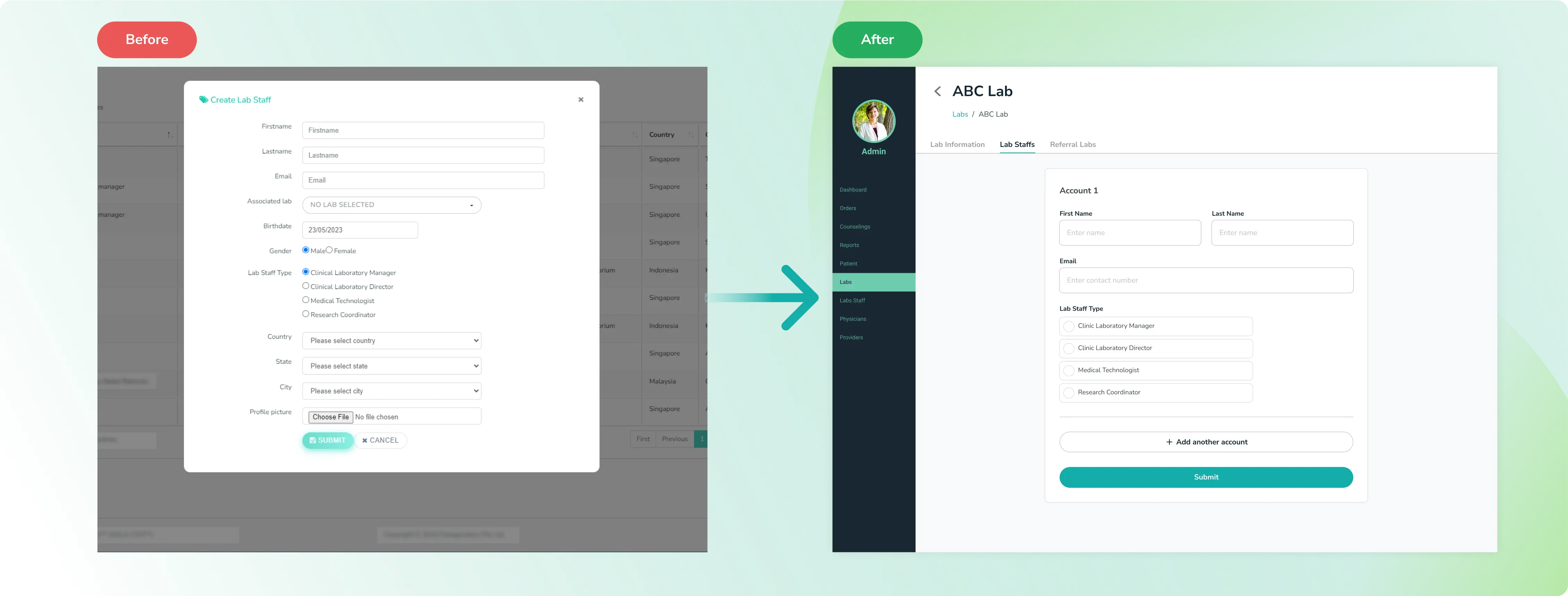
Labs staff before and after
For Provider Account
We improved the field form and remove some field in PIC Section and make the field into context
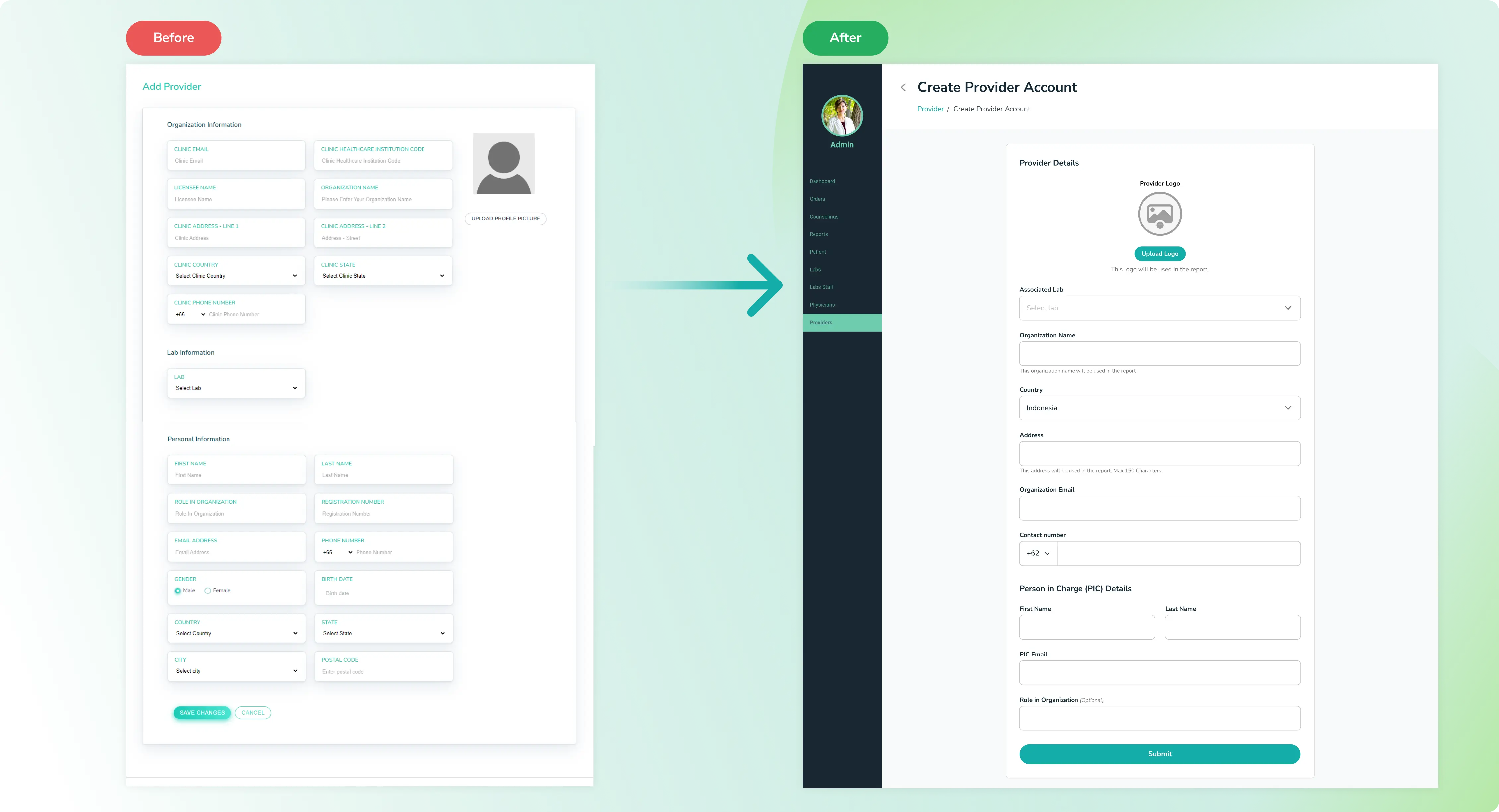
Provider before and after
For Physician Account
we remove some field that is not need to fill in by user admin, user admin just need a name and email to create account. but we still give the physician personalized the profile when they are login with they account.
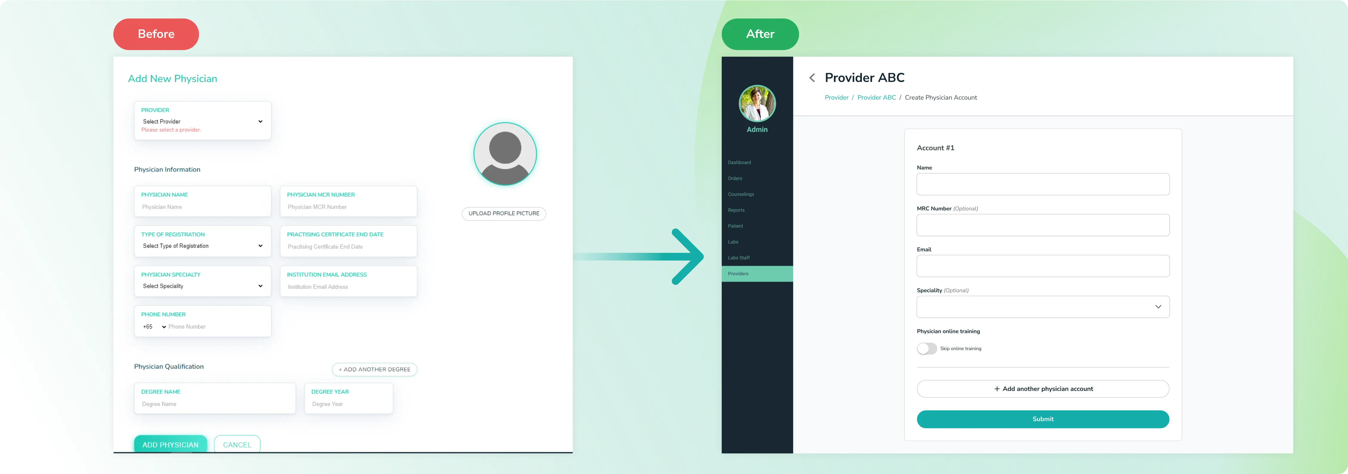
Physcian before and after
Get quick Feedback
I ask for feedback from the User, Design Lead, and Product Manager. so we conducted the meeting with all stakeholders and I presented the design:
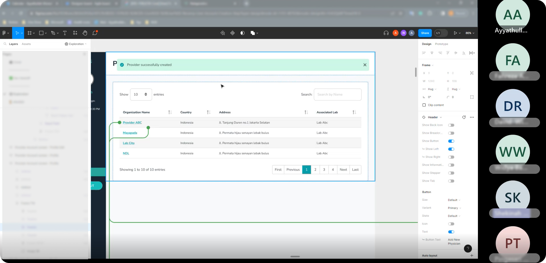
Presentation with Stakeholders Image
Insight
Hard to differentiate primary and secondary action
Add another Account button quite same with submit button
Unclear instructions for Lab/Provider logo
User mistook it for profile picture and uploaded their face/avatar. They should have uploaded the brand logo
Hard to focus because of the long form
In Provider form it’s quite long, User will lack of focus when fill in it
Improvement
Improve the primary and secondary actions
I improved the button by changing the color and adjusting its length
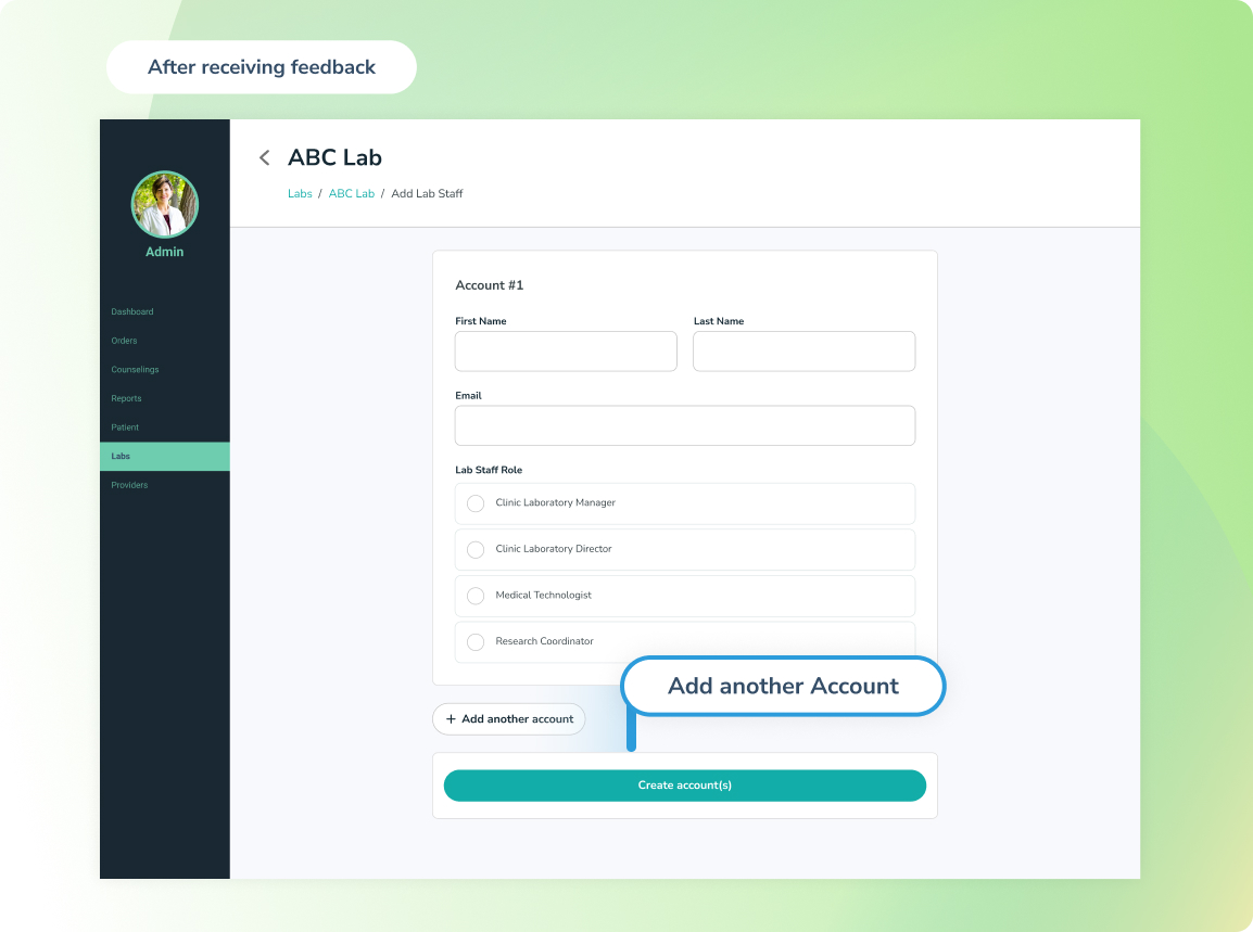
Improve Button
Made clear instructions for Lab/Provider logo
I improved the upload logo design by changing its appearance from uploading a photo to uploading an image/attachment, making it more aligned with user behavior.
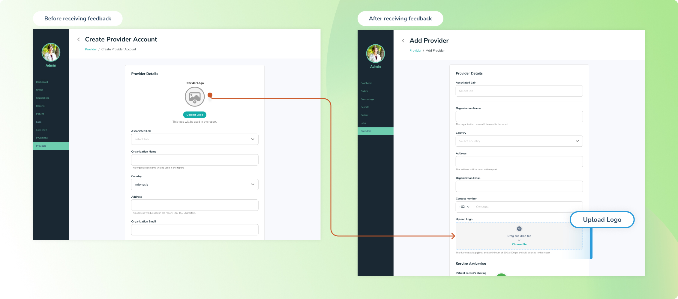
Improve Upload Logo Field in Provider Form
Separate the form into two sections.
The user lacks focus when filling in the provider form since the form is quite long, so I improved it by separating it into two sections.
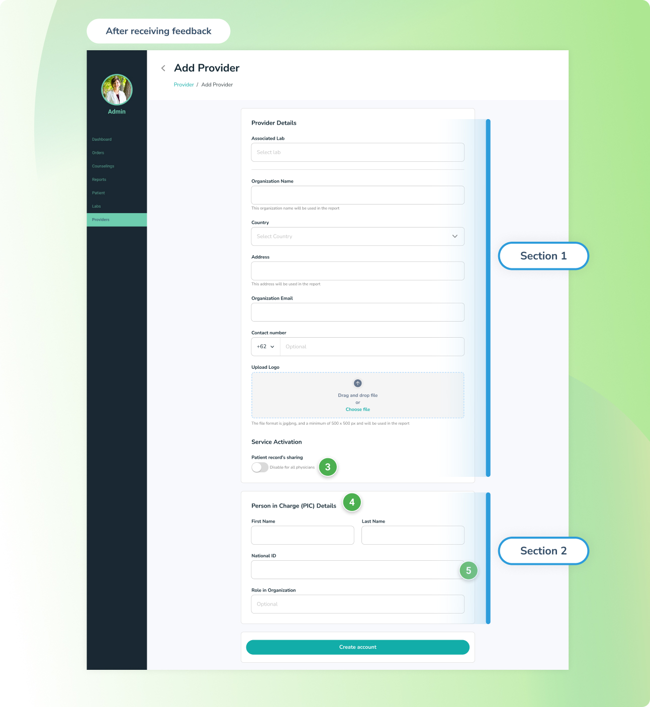
Improve Provider Form
Result
75% faster when the user creates the account
I calculated the time required for a user to finish creating one account and compared it between the old and new designs. Surprisingly, we achieved approximately a 75% faster completion time with the new design for creating an account on our dashboard.
Before
- 1 Lab account: 2 minute 45 second
- Creating 1 Provider Account: 1 minute 45 second
- Creating Physician Account (50 account) x 30 seconds : 95 minutes and 50 seconds
The duration for an admin user to create a one hospital account is: 101 minutes and 10 seconds (1 hour 45 minutes)
After
- 1 Lab account: 45 seconds
- Creating 1 Provider Account: 30 seconds
- Creating Physician Account (50 account) x 30 seconds : 25 minutes
The duration for an admin user to create a one hospital account is: 26 minutes 15 seconds
Here the all of the sample design results:
Lab Create Account Screen
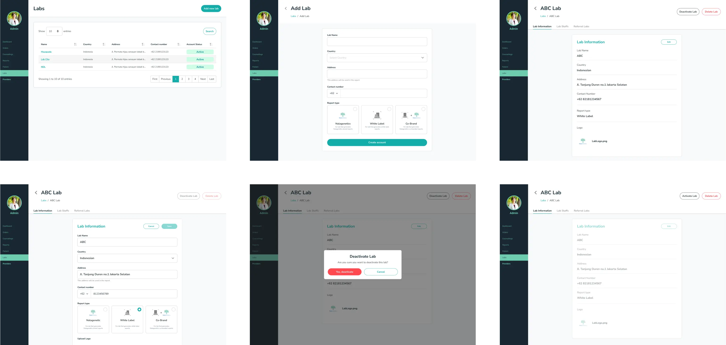
Final Lab Create Account Screen
Lab Staff Create Account Screen
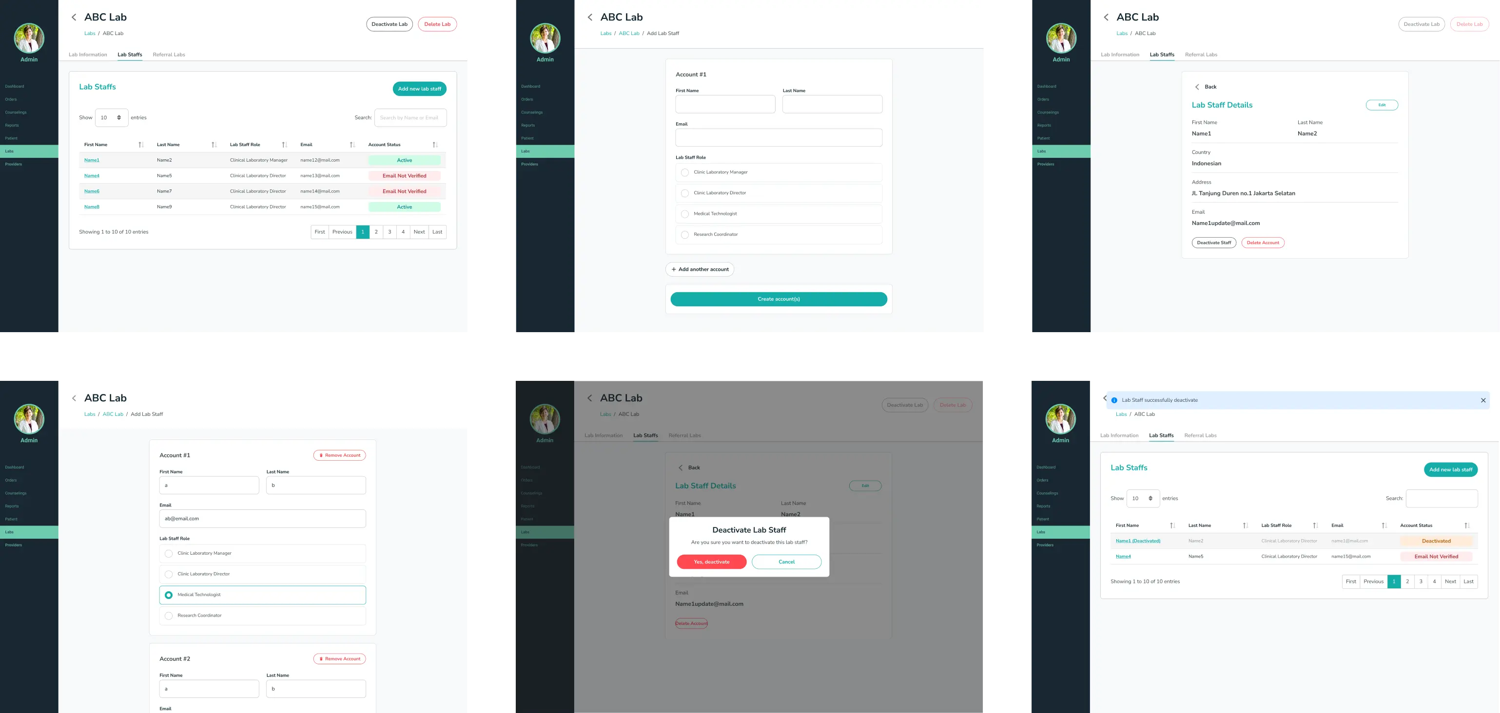
Final Lab Staff Create Account Screen
Provider Create Account Screen
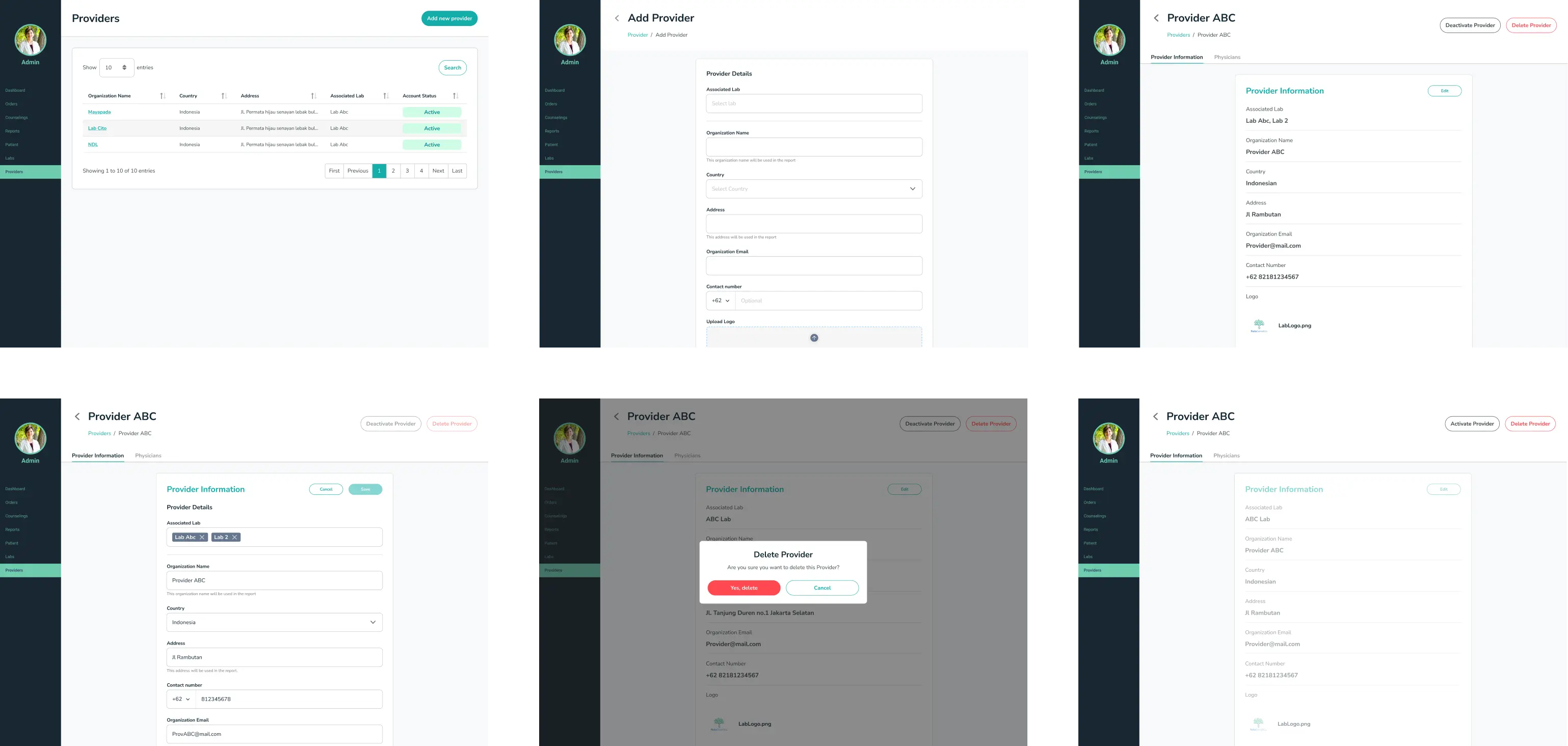
Final Provider Create Account Screen
Physcian Create Account Screen

Physcian Create Account Screen
Lesson Learned
When I worked on this project, I was quite concerned because the tasks were too extensive, and I was afraid of not achieving the desired goals.
However, breaking down this project into small parts, each with its own sub-goals, made it easier for me to tackle them one by one and ultimately achieve the goal of enhancing user effectiveness in creating accounts.
In this project, we encountered quite a few edge cases that needed to be addressed. Understanding the project limitations and collaborating frequently with the project manager can help handle these edge cases either in the current iteration or plan for them in the next one.
It is crucial to collaborate with all relevant stakeholders and be proactive to ensure optimal results.
